
Two different federal agencies released fascinating and consequential maps this week. Together, they tell the story of how we spew greenhouse gases into the atmosphere, then get the help of trees to soak them up. Unfortunately, this process is not a closed loop, and carbon emissions continue to outpace our planet’s ability to compensate for them. It’s one of the most troubling, complex and controversial issues we face. But for now, let’s just look at the maps!
Map 1: Carbon In (to the atmosphere)
The EPA released an interactive mapping tool showing 6,157 major point sources of greenhouse gases in the US. Greenhouse gases are the ones partly responsible for global climate change, and include carbon dioxide, nitrous oxide, methane, and several fluorocarbons. They are commonly measured in metric tons of carbon dioxide equivalent (MT CO₂e), a way of combining all of the offending gases into a single unit of measurement. Point sources are things like power plants, factories and oil refineries, as opposed to non-point sources like cars, trucks and cows.
The interactive Google-based map shows emission amounts at each point location, as reported by those sources, in compliance with a 2008 law signed by President Bush. The map tool is rather klunky, but you can eventually get some interesting (and troubling) information. About 72% of total measured emissions are from power plants. Our nation’s single biggest point source of greenhouse gases is a coal-fired power plant in Juliette, Georgia. It emits nearly 23 million MT CO₂e annually.

Using the map, I tooled around some familiar areas. The largest greenhouse gas emitter in Oregon is the Boardman coal power plant in eastern Oregon (3,947,322 MT). This is where our “green” city of Portland gets most of its electricity. The largest emitter in the Portland region is actually across the river in Vancouver, WA - the River Road natural gas-fired power plant (654,206 MT). Coming in second is the Georgia Pacific paper mill in Camas, WA (174,338 MT), unless you count the SP Newsprint paper mill in Newberg, OR (331,708 MT). In Portland proper, the biggest emitter is Evraz Oregon Steel in North Portland (104,136 MT).
Let’s move east. In Pennsylvania, which emits more greenhouse gases than any other state except Texas (largely due to coal power plants), the biggest source is the Bruce Mansfield Power Plant in Shippingport near the Ohio border (16,326,924 MT). But the Lehigh Valley is no slouch. The winner here goes to the rotting hillside of trash known as the Chrin Brothers Landfill, just south of Easton (2,405,365 MT). Landfills contribute greenhouse gases courtesy of methane from decomposing organic matter. The most greenhouse gas from a Lehigh Valley power plant is 1,562,130 MT, from the Portland generating station on the Delaware River. However, the Bethlehem Township natural gas plant is not far behind (1,303,055 MT). This goes to show, natural gas power plants may be cleaner in terms of particulate matter and toxins, but they still spew plenty of greenhouse gases.
Other maximum emitters in the regions where my readers live:
- New Jersey: Bergen Generating Station (kerosene and natural gas), Ridgefield: 2,551,228 MT
- South Jersey: Paulsboro Refining Company (petroleum), Paulsboro: 1,649,693 MT
- New York: Kintigh Generating Station (coal), Barker: 3,991,150 MT
- Indiana: Gibson Generating Station (coal), Owensville: 17,993,350 MT (that’s a bigg’un)
- California: Chevron Richmond Refinery (petroleum), Richmond (east Bay Area): 4,520,703 MT
Raw numbers like this are hard to visualize, so here are a few comparisons. One metric ton of CO₂e is equivalent to:
- A Boeing 747 flying 6,000 miles (Los Angeles to Seoul, for example)
- The amount of carbon a broadleaf tree such as a maple can absorb over 100 years.
So if you feel guilty about flying, go ahead and buy those carbon offsets, but just know that you and your plane-mates would have to circumnavigate the Earth 15,753 times to generate the amount of greenhouse gases spewed by that one coal power plant in Georgia in a single day. And step up the planting of those trees, residents of Juliette, Georgia, unless you already have 2.3 billion of them nearby.
Speaking of trees, let’s move on to map #2.
Map 2: Carbon Out
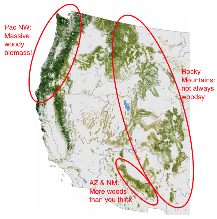
This week, NASA released a high resolution map of forest cover in the lower 48 states. While not interactive like the EPA map, the provided JPEG is 4457x2809 pixels, allowing one to zoom in to sufficient regional detail. Wooded areas are shown in gradations of green, based on the tonnage of “above-ground woody biomass” per hectare. More simply, darker green areas have denser, richer forests. I wish they had drawn state lines on the map; in their place are 66 “mapping zones” that are not explained.
Nevertheless, it’s a fascinating map, for the forests as well as where the forests are not. Scanning around the image, here are some observations:
- The Pacific Northwest is clearly the beneficiary of massive wood! Nearly all the forests west of the Cascade crest are dark green, corresponding to the region’s temperate rain forests thick with vegetation and huge trees. Sadly, the widespread logging of the Oregon Coast Range is also evident. Left alone, the Coast Range would probably look more like the Olympic Mountains to the north, or the Redwood Coast to the south.
- The Rocky Mountains are not as forested as many people think. I noticed this while driving across the country for the first time. There are major gaps in the forest (and the mountains themselves) where I-80 passes through Wyoming and I-90 through Montana.
- Arizona and New Mexico have way more trees than I thought - probably high elevation areas with ponderosa pine and aspen.
- Conversely, eastern Washington’s Columbia Basin is one of the most treeless places in America. And it’s less than 200 miles from the Olympic rain forest. The Cascade Range imposes quite a rain shadow.
- Mountains above timberline stand out quite well, especially Cascade volcanoes like Mount Rainier, Mount St Helens, Mount Hood and the Three Sisters. The high peaks of the Colorado Rockies also stand out, surrounded by descending densities of forest.

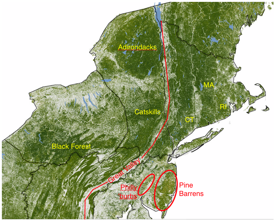
- Other impressively woody regions shown in darker green are the Great Smoky Mountains, central West Virginia, Pennsylvania's Black Forest, and the Adirondacks.
- Connecticut, Rhode Island and Massachusetts are surprisingly forested for such densely populated states. This would have been a different picture 200 years ago when agriculture was much more prevalent.
- In fact, many urban areas end up having remarkable forest cover, including Portland, the north side of Indianapolis, and the Philly suburbs. But not so, San Francisco or Los Angeles.
- The Great Valley is a feature few people know about, but is clearly visible on this map. It’s the long, continuous trench of farmland and towns that starts at Lake Champlain in New York/Vermont, heads south to include Pennsylvania’s Lehigh Valley, Virginia’s Shenandoah Valley and the Tennessee Valley, and ends in Alabama.
- New Jersey’s Pine Barrens are impressive in their contiguity, but not in their concentration of biomass. Hence their name, and their light green color on the map.
- Gradual transitions that you wouldn’t notice in person are visible on the map, like in Minnesota and Wisconsin where the farmland of the south transitions to the North Woods, or where the Piney Woods of Texas give way to the plains.
- Military bases often become de facto wildlife areas. The military likes to maintain wild areas for combat training, and to keep ample buffers between civilian territory and their active operations. Islands of woods are visible at Camp Atterbury in southern Indiana, Fort Knox in Kentucky, and Joint Base Lewis-McChord in Washington state.
- On a personal note, some lesser known visible features include Morgan-Monroe State Forest near Martinsville, Indiana (where I used to mountain bike in high school), The Pinnacle in Berks County, PA (my favorite PA hike), and the blueberry fields around Hammonton, NJ (near where I grew up).

Kudos to both the EPA and NASA for releasing both of these telling maps. As our economy - and that of other nations - picks up steam again, so will the generation of greenhouse gases. Regardless of whether you’re a believer or a skeptic, human-augmented climate change is proven science, and will continue to threaten our planet. As it does, we will need maps like these to help us come up with solutions, including weaning ourselves off coal and preserving forests.
Sources: US EPA, NASA Earth Observatory, The Oregonian, Carbon Footprint Ltd, Travel Navigator. Thanks to George Wacker for sharing the NASA map.
No comments:
Post a Comment